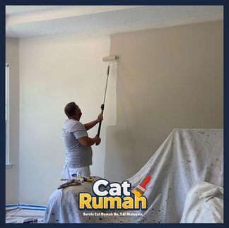
How to Choose Minimalist House Paint So Your Home Looks Premium
- aliasfiah
- Apr 14
- 5 min read
Index

Introduction
A small change in paint selection can make a home look calmer, neater, and more premium ✨
Choose paint colors that feel soft, clean, and consistent with your home concept. For a minimalist style, tones like warm white, greige, beige, light grey, and soft olive often make a space look more expensive without needing excessive decoration.
Many people think a home looks premium because of expensive furniture. In reality, wall color is the main backdrop that strongly shapes the mood, lighting, and exclusive feel of a space. When paint is chosen well, even a small home can look more spacious, calm, and organized.
Why Paint Color Matters So Much
In a minimalist home, the right color helps the space feel more structured and comfortable to look at 🏡
Paint sets the foundation for the overall look of the home
In a minimalist home, every element should feel neat and intentional. That is why paint color is so important. When tones are too bright, too dark, or mixed too heavily, the house can quickly feel cluttered.
Some of the main reasons paint color has such a big impact:
It helps a space look larger
It makes natural lighting look more beautiful
It highlights furniture and décor without making the room feel heavy
It creates a calm, clean, and modern atmosphere
Premium does not always mean expensive paint
The secret is not only the brand. What matters more is the tone, the finish, and how well the colors work from one space to another. Premium homes usually feel visually calm, not overloaded with color, yet every corner feels thoughtfully planned.
Colors That Make a Home Look Premium
You do not need bold colors. Soft tones are often more effective at creating an exclusive feel 🎨

Warm white for a clean and soft feel
Warm white is easier on the eyes compared to a very stark white. 🤍 It works well for living rooms, dining areas, and bedrooms because it creates a spacious, soft, and elegant effect.
Greige and beige for a mature modern style
Greige is a blend of grey and beige. It looks modern without feeling too cold. 🌿 This color is very popular for modern minimalist concepts because it feels neutral, elegant, and easy to pair with wood, matte black, or linen curtains.
Light grey for an urban touch
Light grey works well if you want your home to feel more contemporary. Just make sure it is not too cool, especially if your home gets limited natural light.
Soft olive green for a premium accent
If you want a little difference, use soft olive on one feature wall or a specific corner. It looks exclusive while still feeling calm.
Paint color can look very different depending on daylight and night lighting 💡
Check it in the morning, afternoon, and at night
Paint color can shift depending on the light. That is why you should never choose a color from the catalog alone. Apply a small sample on the wall and observe it at three different times of day.
Things you should check:
Does the color look too yellow during the day?
Does it become dull at night?
Do warm white or cool white lights change the tone too much?
Adjust based on room size
For small homes or apartments, choose light and soft colors so the space feels more open. For larger spaces, you can introduce slightly deeper tones so the home feels cozier while still looking premium.
Paint Mistakes to Avoid
Sometimes the color is not bad at all. The problem is the way it is chosen and paired ⚠️
Using too many colors in one home
One common mistake is giving every room a different color. As a result, the home loses its flow. For a minimalist style, two to four main tones are usually enough.
Choosing the wrong finish
Not every space suits the same finish. For example:
Matte: beautiful and soft for living rooms or bedrooms
Eggshell or satin: easier to clean for active areas
Semi-gloss: suitable for trims or doors
Ignoring the color of floors and furniture
Even a beautiful wall paint can look strange if it does not match the floor, cabinets, sofa, and curtains. Before choosing paint, look at the overall home palette, not just the walls.


Did You Know?
Homes that look expensive usually use a calm and consistent color palette 👀
Neutral colors actually help a home feel more exclusive
Many people do not realize that homes that look expensive usually do not use loud colors. Instead, they rely on colors that feel calm and consistent.
Interesting points that are often overlooked:
Neutral colors help décor stand out more beautifully
Soft contrast feels more luxurious than overly strong colors
Walls that are too white can look harsh if the lighting is not suitable
The combination of paint, lighting, and fabric texture strongly affects the final result
Suggested internal links for your blog:
How to choose curtains for a minimalist home
Small living room ideas to make the space look bigger
Tips for arranging furniture in a modern home
Conclusion
When color, lighting, and layout work together, a home instantly feels more exclusive ✨
If you want your minimalist home to look premium, focus on three main things:
🎨 the right neutral tones
🎨 suitable lighting
🎨 color consistency from one space to another
You do not need too many colors or overly packed decoration. Sometimes, a simple paint choice that is done right is enough to transform the whole feel of a home into something more exclusive, modern, and comfortable to live in. The takeaway is simple: choose colors that feel clean, soft, and mature, not just beautiful in a catalog, but beautiful in the real space of your home.
Start with paint first. It is the most practical step and the one that gives visible results the fastest.
FAQ
What minimalist house paint colors are the safest choice for a premium look?
Warm white, greige, beige, and light grey are among the safest options because they are easy to match with many concepts and furniture styles.
Is a dark color suitable for a small home?
Yes, but it works better as an accent. For the overall space, lighter colors usually help a small home feel bigger.
Is matte or satin better for a minimalist home?
Matte looks beautiful for a soft and modern finish, while satin is more practical in areas that are frequently touched or easily get dirty.
Do I need to use the same color throughout the whole house?
Not necessarily 100 percent the same, but it is best to keep a consistent palette so the home looks neater and more luxurious.
How do I test paint color before painting the whole house?
Buy a small sample, apply it to a few parts of the wall, and observe how the color changes in the morning, afternoon, and at night before making a final decision.
Give Your Home a Neater and More Premium Touch 🎨


We can help recommend colors, concepts, and combinations that suit your home style 😊
Contact us now, request a consultation, or WhatsApp us to explore the best ideas based on your space and budget.


Comments