Luxury House Paint Colours: 12 Best Picks to Make Your Home Look Expensive (2026)
- Nabiha Az
- 1 day ago
- 5 min read
📋 Table of Contents

Introduction
Every homeowner wants a home that looks expensive and classy. The good news is you don't need a big budget to get there — what you need is the right colour, smart pairing, and a clean finish.
Many people assume an expensive look comes from costly furniture. The truth is that wall colour is the cheapest yet most powerful element for transforming a home's entire mood.
So the real question isn't simply "what colour looks nice?", but which colour makes your home look luxurious and suits your style. Here are 12 luxury house paint colours for 2026, with pairing tips and advice from our experience painting hundreds of homes across Malaysia.
☀️ What Makes a Paint Colour Look Luxurious?
A luxury look isn't about the price of the paint — it's about harmony, depth, and finish. Here's the secret:
Deep neutrals feel calm and high-end, unlike generic bright colours.
Soft contrast between walls, ceiling, and furniture makes a space feel cohesive.
Matte or eggshell finishes reflect light gently and hide wall imperfections.
A consistent palette across the home makes every space flow neatly.
By contrast, too many bright colours mixed together, or a glossy finish that highlights every scratch, will make a home look cheap no matter how much it cost.
🎨 12 Luxury House Paint Colours for 2026
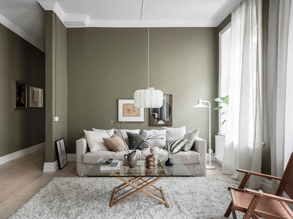
Classy Neutrals
Neutrals are the safest base for a luxury look because they're timeless and easy to pair.
Warm white — clean, bright, and never goes out of style. Great for living rooms and kitchens.
Greige (grey + beige) — the most popular modern neutral right now; classy and versatile.
Soft taupe — gentle and soothing, ideal for relaxation spaces.
Light grey — modern and easy to pair with wood or metal furniture.

Dark & Dramatic
Dark colours create a luxurious, dramatic effect when used correctly, especially on feature walls.
Charcoal grey — an elegant feature wall; pair with light furniture.
Deep navy — classic and luxurious, great for living rooms or reading nooks.
Forest green — fresh, premium, and on-trend for feature walls.
Espresso brown — warm and refined for a more intimate mood.

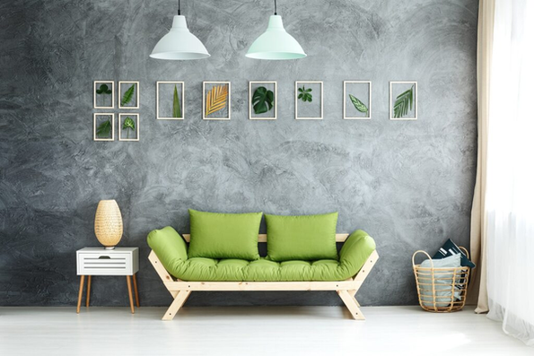
Soft & Calming
Soft colours give a subtle, modern luxury look.
Sage green — calm, on-trend, and suits almost any space.
Dusty blue — soft and cooling, ideal for bedrooms.
Blush nude — subtle and modern, adding warmth.
Cream — warm and luxurious, a softer alternative to white.

🏠 Luxury Colours for Each Part of the Home
The same colour won't suit every space. Here's a quick guide:
Living room: warm white or greige as a base, with a single charcoal or navy feature wall.
Bedroom: soft colours like sage green or dusty blue for a calm mood.
Kitchen: white or light grey for a clean, spacious look.
Exterior: grey, charcoal, and earth tones give an expensive modern look that holds up in Malaysia's weather.
For terrace homes and bungalows in Malaysia, pairing grey exterior walls with dark pillars or doors is a combination that always looks premium.
🎭 Colour Pairing to Look More Expensive
The secret to a luxury look is colour pairing, not a single colour. Try these formulas:
60-30-10: 60% neutral base, 30% secondary colour, 10% accent (accessories).
Monochromatic: several tones of the same colour (e.g. light grey, mid grey, charcoal) for a refined look.
Neutral + one dark: a light base with a single dark feature wall.
Brands like Nippon Paint and Dulux offer wide ranges of neutral and premium colours, so it's easy to find the exact tone for these formulas.
💡 Common Mistakes That Make a Home Look Cheap
Too many colours in one space — confusing to the eye.
An overly glossy finish — highlights every wall flaw.
Skipping wall preparation before painting — gives an uneven result.
Choosing colours straight off the swatch card without testing on a real wall.
Avoiding these mistakes alone separates a home that looks expensive from one that looks cheap.

🖌️ Why Finish & Quality Matter Just as Much
A beautiful colour won't look luxurious if the paintwork isn't clean. The final result depends on:
Surface preparation — filled, sanded, and smooth walls.
Primer for an even, long-lasting colour.
Two coats for full colour depth.
Skilled application with no roller marks or uneven patches.
This is why the quality of the paintwork matters as much as the colour you choose.

🌈 Luxury Colour Trends for 2026
Beyond the classics, several luxury colour trends are growing in 2026. Knowing them helps you choose colours that stay relevant for years:
Warm minimalism — warm neutrals like cream, taupe, and beige for a calm, clean, expensive look.
Earthy tones — nature-inspired colours like soft terracotta, clay, and olive green for premium warmth.
Moody dark accents — deep green or navy feature walls paired with gold or brass on accessories and frames.
Two-tone walls — two colours on one wall (e.g. dark lower half, light upper half) for a boutique-hotel look.
These trends share one principle: fewer colours, more depth. Instead of mixing many bright colours, focus on a few deep, well-paired ones.
💰 How Much Does This Luxury Look Cost?
The good news is a luxury look doesn't require a big budget. With painting prices starting from RM3.50/sqft, you can transform your home's entire mood with premium colours and a clean finish. Investing in quality paint and professional work gives the best return because the result lasts and won't need frequent repainting. Compared with buying new furniture, repainting is the most affordable way to raise the look and value of your home.
✅ Conclusion
For a home that looks luxurious in 2026, choose deep neutrals or dramatic darks, stick to a coordinated 2–3 colour palette, and make sure the finish is clean. With the right colour, smart pairing, and skilled application, your home can look expensive without the big spend.
Make Your Home More Beautiful Today! 🏠✨
❓ Luxury Paint Colour FAQs
1. Which house paint colour looks the most luxurious?
Deep neutrals like greige, charcoal grey, and deep navy often give the most luxurious, high-end look, especially when paired with a matte finish.
2. Are dark colours suitable for a small home?
Yes, if used on a single feature wall only. For other walls, use lighter colours so the space still feels spacious.
3. Which finish looks the most luxurious?
Matte or eggshell finishes give a smoother, more luxurious look than glossy finishes that highlight wall flaws.
4. How many colours should I use in one home?
Stick to 2–3 main colours across the home for a coordinated look. Use the 60-30-10 formula for a refined balance.
5. Which paint brand suits luxury colours?
Nippon Paint and Dulux offer wide ranges of neutral and premium colours with good finishes, ideal for a long-lasting luxury look.


Want your home to look expensive and classy without breaking the bank?
The CatRumah team are experts at selecting premium colours and applying them with a clean finish that makes your home look luxurious. From colour selection to the final coat, we handle everything for you. 💬


Comments